


B is for Backgrounds
B is for Backgrounds
Different approaches for illustrating backgrounds in picture books


B is for Backgrounds
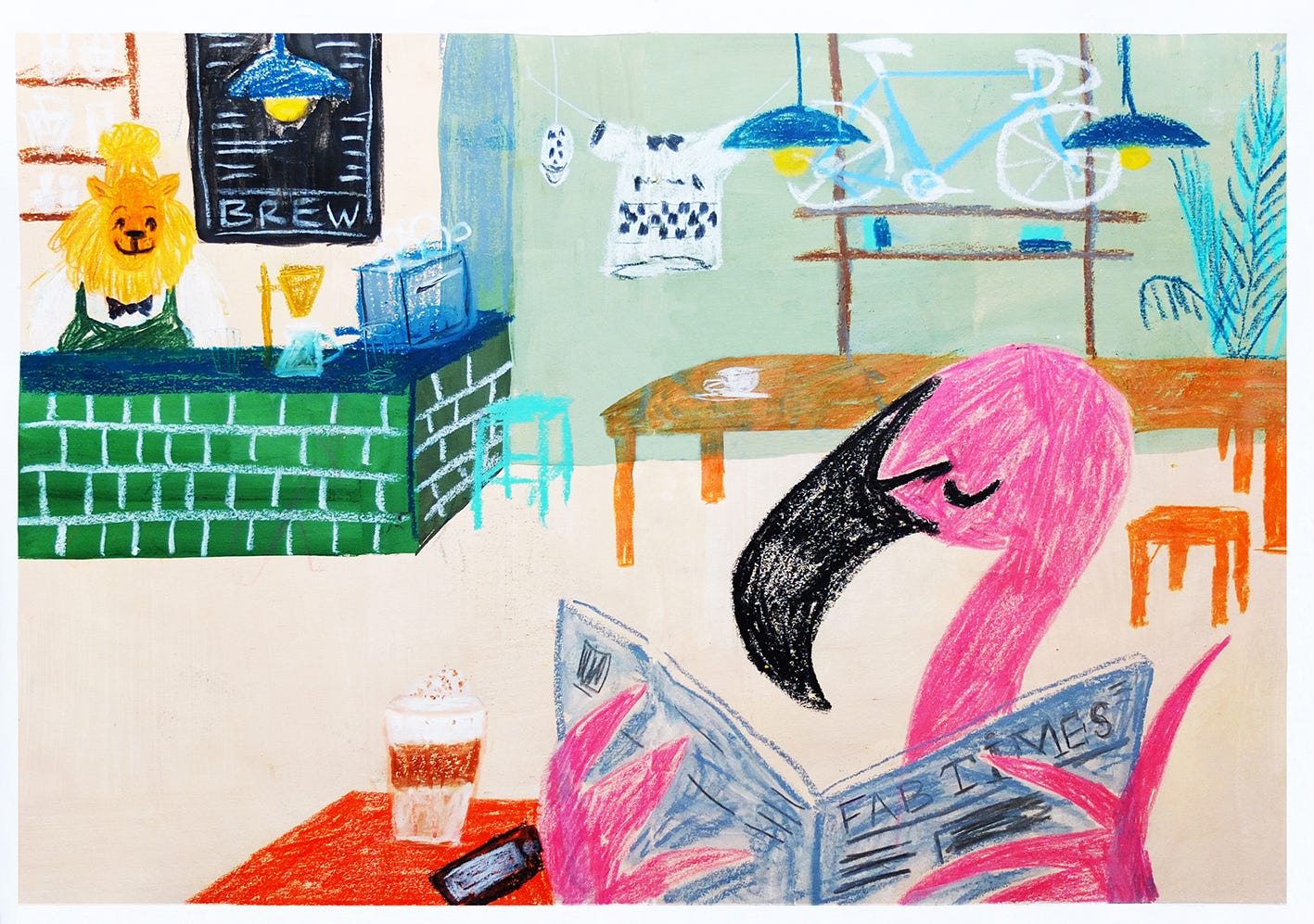
When I first started illustrating for picture books, I felt a bit intimidated having to fill an entire spread or page. If I’m honest, I still am. My favourite part of the process is developing characters (more on this next time!) but placing that character in a believable environment can be challenging for me. I had a breakthrough moment during my MA when my friend Lilla Turi pushed me to make a full page illustration in my sketchbook, something I had never done before. I was unsure of how to approach this challenge and, off course, started overthinking it. After tiring out my brain I eventually sat down next to Lilla and just started painting, using a sketch I had made earlier. The result is the image below, an illustration called Flamingo Café. It’s quite rough and definitely not perfect, but I learned that day that I can’t solve visual puzzles in my head and that it’s best to just start and wing it until you figure things out. As with most things really.
Rebecca Green muses in one of her Patreon videos about this topic:
“You know when you’re starting a painting and you’re terrified that you’re going to mess it up, so you don’t start it. There is a sense that this feeling goes away the more you feel confident making work but that’s not really been the case for me. I’m still paralysed starting stuff, still terrified that it’s not going to work out and the only way to not let that feeling consume me is by making work anyway. And then usually once you jumped into it and get a little more comfortable I feel like ‘I’ve got this’. All you can do is just show up and make work and not be too precious about it.”
If it wasn’t for the association with a certain famous shoe brand, ‘Just do it’ would be my mantra when making art. For now I’m going with ‘Let’s crack on, shall we?’1
Background
noun
plural noun: backgrounds
the part of a picture, scene, or design that forms a setting for the main figures or objects, or appears furthest from the viewer.
Whether you’re a minimalist, maximalist or an in-betweenist like me, there are a loads of different ways you can approach illustrating your backgrounds. Let’s have a look at some of my favourite picture books and examine how it’s done.


Eye for detail
In ‘The Marvellous Fluffy Squishy Itty Bitty’ Beatrice Alemagna treats us to loads of glorious full page illustrations filled to the brim with tiny details. In the book we follow the main character Eddie on a quest around town for the perfect present for her mum’s birthday. At the bakery we see rows and rows of croissants, cakes and loaves of bread and the fashion shop is chock-full of handbags, pairs of shoes, hats and cute dresses. One spread, in which the Eddie is at the butcher shop, even folds out to show another page of customers waiting to be served. Each page is filled with quirky details for us to pore over. To make Eddie stand out in all this detail, Alemanga has given her a bright pink coat to wear so she’s easy to spot. Detailed backgrounds add to the richness of the illustration revealing more and more with each reading, making the backgrounds almost a character in their own sense.
Backgrounds with big shapes
In ‘Mina’ and ‘Pokko and the Drum’ Matthew Forsythe creates lush backgrounds by painting big, more abstracted shapes. There are still plenty of details, but the main focus is on the characters. Here the backgrounds serve more as a sort of stage set for characters to perform in. In the image below you can see that the pictures on the wall behind Mina’s dad (who is playing the banjo) have blurry edges, and that other bits of the backdrop are also not fully filled in. Even without these details, we as readers, still understand that this space is a living room.
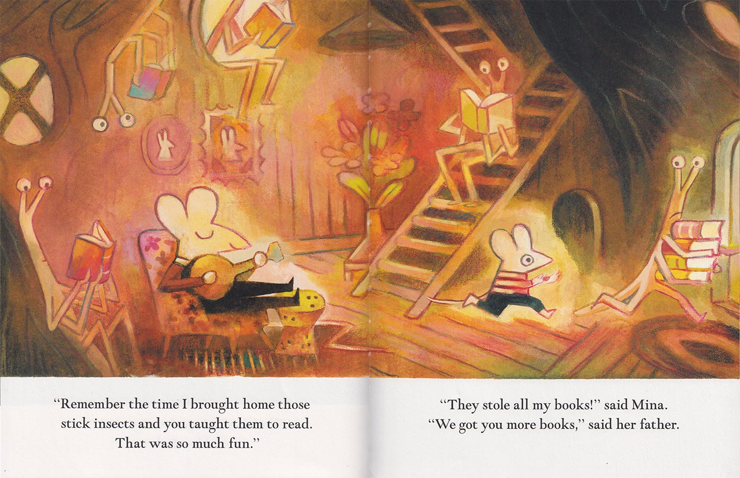
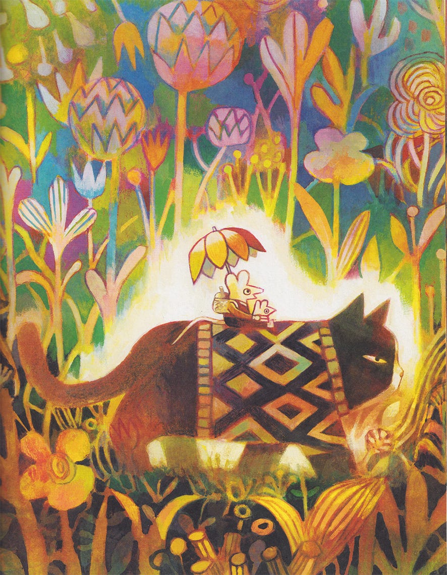
In the image in which Mina and her dad riding the ‘squirrel’ through the woods, Forsythe uses bold, abstracted shapes for the leaves, flowers and sticks. The glow around the characters and the darker colour palette at the bottom of the image pull your eye towards Mina, her dad and their ‘squirrel’.2
In ‘Gaston’ by Christian Robinson the backgrounds are simplified even more. By using only flat colour and flat shapes he creates a kitchen, a living room and a park. With the clever use of white space, the adorable puppies stand out on the pages.


Backgrounds that incorporate white space
My favourite picture book this year has to be ‘A Mouse Who Carried a House on His Back’ by Isabelle Arsenault. I absolutely adore the softness of the characters, the use of collage and the way white space is part of the story.

‘A Mouse Who Carried a House on His Back’ follows Vincent the mouse as he meets more and more animals looking for shelter. The first few pages show Vincent putting down his house and meeting the first character, a bullfrog. The only elements on the page are the characters, the house (a gorgeous die-cut through the book) the muddy brown floor and the grass growing from it. As the story progresses the pages are filled with more and more houses and on the inside of Vincent’s house we see how a variety of furniture is added each time a new visitor enters.

In this lovely dinner scene the main focus is on the table and the surrounding animals, and we could say that the background consist solely of the string of lights and lamps on the ceiling and the rugs on the floor. Without these elements the characters would be floating on the page. I love how just a few details can pull an image together and create the impression of a space. As we reach the end of the book, the house is gradually being more filled up and less and less whitespace is being used.
In my own work I also like to use a lot of white space. I blame this on my background in graphic design, but also on me not being completely comfortable (yet) filling the entire page. My original sketch for the illustration above included a full page kitchen scene with a window and a kitchen table, but after finishing the artwork I felt it was distracting from the main elements. Leaving out the window and table also created room for the text.
How do you approach illustrating backgrounds? Or, if you have any recommendations for other epic illustrators, let me know in the comments. See you in two weeks, for C is for Character.
Thanks for being here!
x Maris
Links
Beatrice Alemagna - ‘The Marvellous Fluffy Squishy Itty Bitty’
Isabelle Arsenault - ‘A Mouse Who Carried a House on His Back’
I love your Flamingo café! Really good to see all the examples you've picked. I get a bit too obsessed with making things straight in interiors which I really shouldn't worry about. I use skirting boards and suggested wallpaper a lot!